Hello again!
Today we did a group meeting in class and it really helped me voice my ideas to people outside my project group. The members were very supportive of my ideas and offered constructive criticism of how I could improve my plan for the magazine.
One piece of advice was that I could try breaking usual representation practices and include a male wearing makeup or 'feminine' clothing. I believe this could be a great way to combat sexist stereotypes and will definitely consider including it in my project.
The members of the group thought that my post about graphic design programs was well-done and highly detailed, which helped me understand how I should structure my future blog posts. One member even recommended a design program called Affinity Designer, so I’ll be looking into that soon.
Another aspect of the meeting that was very helpful was when I talked about my ideas for the name of the magazine. I’m looking for artistic, abstract names, so here are some: "The Fit", "runAway", "A La Mode", and "Cosmic". They showed great enthusiasm for the name “The Fit” since it sounded very attractive to them. I’m glad they helped me understand what name they believed stood out the most since they represent my target audience and should therefore be enticed by my title.
Also, the asked me questions about what kind of ‘theme’ I was going for, and I explained that I was looking to create either an indie fashion magazine or a magazine that looked more like Seventeen and Marie Claire. After showing them several examples of indie fashion magazines, they loved their clean and artistic look! I will be doing more research into that specific genre in the future, so stay tuned!
Lastly, I discussed that my group wanted to have different color schemes within our magazines so we would be making editions from different seasons. I expressed my interest in fall magazines because of their warm tones and content, and the members of my group fully supported my decision and advised that I make the content of my two-page spread representative of fall events and holidays, such as Thanksgiving.
I’m very thankful for having had the opportunity to discuss my doubts and future plans with my peers, who were able to offer me key advice that helped clarify my decisions and provided me with ideas of what to include in my project. I hope we do this activity again soon because I know it really benefitted me and most everyone in my AICE Media class.
Signing off for now,
Catalina
Thursday, February 28, 2019
Sunday, February 24, 2019
Researching Graphic Design Programs
I did research on some programs that I could use to make my magazine! Most of these are for graphic design rather than photography editing. I’m looking for a program that has a wide range of graphics, is easy to use, and is preferably free. Here’s what I found:
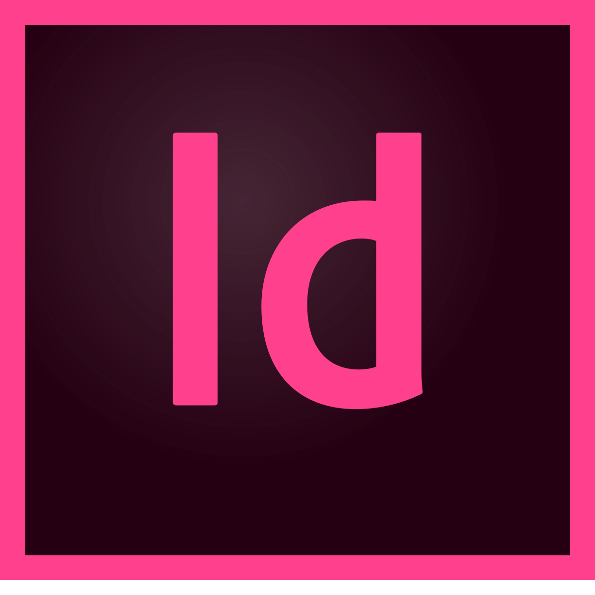
Adobe InDesign: This software application is very popular amongst designers. It has great graphics and tools for making a magazine, and so many fonts and colors to choose from. It has a very similar layout to that of Adobe Illustrator and Photoshop, both of which I have previous experience with. However, the program does require a paid monthly subscription (20.99 per month for a single app). Also, the program looks pretty complex so I would have to watch several online tutorials to get the hang of it. Overall a great option but I don’t think it’s my first choice.

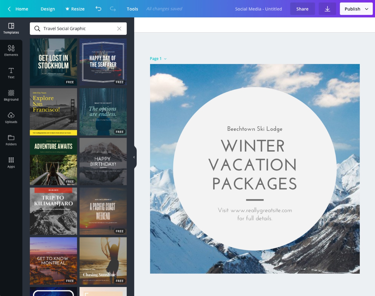
Canva: I LOVE CANVA! So I might be a little biased when I say that it’s awesome. It has a user-friendly layout, has thousands of graphics, and best of all… (drumroll please) it’s free! It offers countless design templates or you can make your own from scratch. If you’re having trouble with a certain aspect of the program, you can watch a quick how-to video to help guide you. It even has interactive tutorials to help practice your design skills. Plus, it has millions of fonts to choose from; but if you can’t find one that best suits your design, you can upload your own font that you’ve previously download (I’ve tried it using a font from https://www.dafont.com). The program is available as an application on mobile devices or as a website on a laptop or computer. What’s not to love? Needless to say, Canva is probably my first choice.
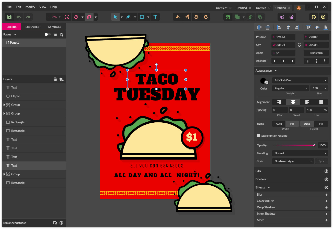
Gravit Designer: This program is another great option, which I have a little bit of experience with. It offers both a User Guide and online tutorials (on their Youtube Channel) for those of us who need a little extra help with navigating the program. I tried out the free version, and I must say it doesn’t disappoint. They have so many shapes, illustrations, icons, emojis, stickers, frames, and lines that are perfect for a magazine. The program mostly uses vectors for designing, which may be a little time consuming for my work and time constraint. The layout reminds me of the Adobe InDesign one in that it’s pretty complex. Another downside is that it only allows users to have free access to the ‘pro’ version for 15 days, after which they must pay $79.20 per year. This program is great for professional graphic designers, but I’m not sure I would use it for my portfolio project.

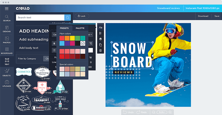
Crello: This program is very similar to Canva; it’s user-friendly and has so many colorful design templates. By making a free account, you’re able to upload your own photos and have access to a wide array of English/Latin, Cyrillic, and Hebrew fonts. They have a lot of stickers, lines, borders, and frames that are useful for making an engaging magazine layout. The site does have a how-to guide with tutorials and tips and tricks to teach users how to use a certain feature. The only downside is that you have to pay $0.99 for any background, but it’s understandable. Also, Crello Pro is available for 19.99 per month to have access to more designs and templates. All in all, this is a great site that I will consider for my magazine production.

Superimpose: This app, which costs $1.99 on the App Store, is used to… you guessed it: superimpose an image on top of another. You can mask out any unwanted parts or smoothen the edges of a picture to create a product that looks very professional in a short amount of time. I have this app downloaded on my phone and I have extensive experience with it, so it’s definitely something I’m going to use to make a part of my magazine. In a previous blog post, a talked about making a ‘collage’ with different clothing items or products on top of each other, so this application will come in handy for that. I highly recommend this app for anyone looking to make a collage or cool picture like the one with the waterfall below.

Smart Closet: After the shutdown of one of my all-time favorite apps, Polyvore, Smart Closet is a very similar alternative that allows users to explore fashion and beauty products to create their own personal ‘lookbook’. It’s completely free on the app store, and you can even upload your own products to personalize it with your own pieces. The app also serves as a way for users to find and shop for items using different filters (brand, color, price, size, etc). I will definitely try to use this in my own magazine project as I am planning to make one page of my two-page spread a collage with clothing and beauty products.

See you soon!
Catalina
Image Citations (in order of appearance):
Wikipedia. (2019, January 05). Adobe InDesign. Retrieved February 24, 2019, from https://en.wikipedia.org/wiki/Adobe_InDesign
Adobe. (2018, October 15). Workspace basics in InDesign. Retrieved February 24, 2019, from https://helpx.adobe.com/indesign/using/workspace-basics.html
LinkedIn. Canva. Retrieved February 24, 2019, from https://www.linkedin.com/company/canva
Canva. About. Retrieved February 24, 2019, from https://about.canva.com
MacUpdate. (2019, February 1). Gravit Designer. Retrieved February 24, 2019, from https://www.macupdate.com/app/mac/59606/gravit-designer
Linux-Apps. (2018, May 29). Gravit Designer. Retrieved February 24, 2019, from https://www.linux-apps.com/p/1237943/
Crello. Crello. Retrieved February 24, 2019, from https://crello.com
Okoi, Martins D. (2017, October 26). Crello - A Free Cloud-Based Graphic Design Tool. Retrieved February 24, 2019, from https://www.fossmint.com/crello-a-free-cloud-based-graphic-design-tool/
iTunes App Store. Superimpose. Retrieved February 24, 2019, from https://itunes.apple.com/us/app/superimpose/id435913585?mt=8
App Spliced. Superimpose X. Retrieved February 24, 2019, from
iTunes App Store. Smart Closet- Fashion Style. Retrieved February 24, 2019, from
Smart Closet. Manage Your Closet and Share Your Style. Retrieved February 24, 2019, from https://smartcloset.me/app
Saturday, February 23, 2019
Guess Who's Back, Back Again
We’ve officially started working on our portfolio projects! This is both a challenging and exciting task so I’m determined to work really hard to make a product that I’m proud of. Yesterday my group decided that we would be doing a beauty/fashion magazine. We decided against a travel magazine because we felt that we would be limited to nearby locations, such as Fort Lauderdale and Miami for our content. Although these places are very diverse and have countless of cool spots, we thought that this would make all of magazines too similar to each other. We also thought that, given our busy schedules, a beauty/fashion magazine would be more feasible since we all have makeup and clothing in our homes. What also led to this decision is that we’re all really passionate about this genre. Valentina is an amazing makeup artist, Malena wouldn’t trade her accessories for the world, and I love to experiment with new clothing trends. I’ve always enjoyed flipping through beauty/fashion magazines, looking at the different articles and models wearing the most ‘in’ clothing. Ultimately these factors led us to our final decision, so I’m glad we all had similar experiences with the genre.
I can’t wait to start taking pictures and making the layout. I have several ideas for the cover design, images, and article content. But all in due time. For now, I’m doing more in-depth research on beauty/fashion magazines, since I’ve already investigated the genre in a previous blog post. I found that most magazines in this genre have monthly publications; so in order for every member in our group to have distinct content, we’ll be assigning each other a month within a specific season. For example, if Malena would like to do summer, she can have either a June or July publication. As for me, I’m really interested in fall beauty/trends, so my publication could be from September, October, or November. This way, we can all have a similar overall ‘theme’ (cover layout, table of contents layout, article layout, etc.) while having a different color scheme (warm, darker tones for fall/winter and brighter, vibrant colors for spring/summer).
One thing that I’d love to create in my double-page spread is a collage, cutout, or messy look with clothing or beauty products. I’m really interested in how engaging these pages are, especially the ones with the makeup that’s neatly spilled (oxymoron?) on the white background. Something that I noticed was that most of these types of pages have a color scheme, such as pink products or plaid clothing. I’ll be drawing inspiration from these magazines:
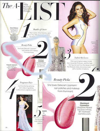 |
| Harper's Bazaar |
 |
| BRIDES |
 |
| Black Hair |
 |
| Vogue |
In my magazine, I plan on implementing this in my double-page spread, such as having one page with the collage look and the other with text explaining the clothing or beauty product choices. For example, the article could be about “What to Wear to Thanksgiving Dinner” so the collage would have semi-formal, warm toned attire and makeup products. The article could be about how to pair the pieces to make an outfit depending on the reader’s personal style.
Some things that our group needs to keep in mind as we move forward:
Many magazines place their cover image on top of their masthead, so some letters of the masthead are not visible behind the model’s head. Oftentimes this is not a problem because the magazine is well-known so the target audience does not need the full masthead to be seen for it to be visible. Here’s an example from InStyle Magazine:
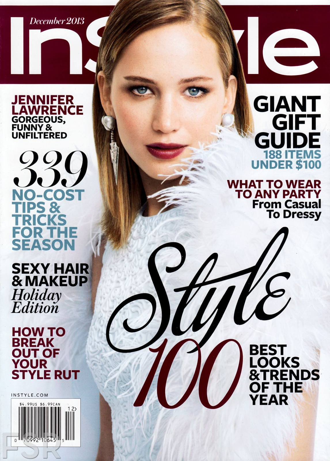
However, this is not a feature that we can include on our cover because our magazine is not well-known, so the full title must be visible for it to be understood. Therefore, we must place the masthead on top of the cover image, like this example from Fashion Magazine:

My group is planning on maintaining a white background for the table of contents and double-page spread. This is not only logical because magazines have a white background to reduce printing costs, but it also helps draw attention to the actual content of the page and creates a clean, simple look.
For our target audience, we are planning on creating our content for 15-30 year-old middle/upper class women. Our cover image will be a female and our two-page spread will be about women’s fashion and beauty trends. Additionally, we will be displaying our social media handles (Instagram, Snapchat, Twitter, Facebook, and possibly a blog) on one of our pages, such as the table of contents. This is another strategy we'll be using to target our audience since they are usually active on social media and enjoy having fashion and beauty content easily accessible on the internet.
That's all for now! See you tomorrow ;-)
Catalina
Image Citations:
Image Citations:
Fashion Staff. (2014, September 08). FASHION Magazine October 2014 Cover: Blake Lively. Retrieved February 23, 2019, from https://fashionmagazine.com/fashion/fashion-magazine-october-2014-cover-blake-lively/
Illuminare Cosmetics. (n.d.). Celebrity Spotlight. Retrieved February 23, 2019, from https://www.illuminarecosmetics.com/Articles.asp?ID=120
IMAN Cosmetics Europe. (2015, July 24). Iman in Black Hair Magazine UK. Retrieved February 23, 2019, from https://iman-cosmetics.fr/blogs/news/iman-in-black-hair-magazine-uk
Pandit, R. (2016, May 23). Top 10 Fashion Magazine In The World. Retrieved February 23, 2019, from http://www.oimfashion.com/worlds-best-fashion-magazine/
Racquel Thomas. (n.d.). Vogue Layouts. Retrieved February 23, 2019, from https://www.racquelthomas.com.au/filter/fashion/Vogue-layouts
Sarah Brock. (n.d.). BRIDES. Retrieved February 23, 2019, from http://www.sarahbmakeup.co.uk/brides-magazine.htm
Wednesday, February 13, 2019
Music Magic
Hello! It's good to be back.
This month, I was assigned to complete a Music Marketing Campaign along with two other group members. We had to produce a marketing and distribution plan for an up-and-coming indie rock band. This included creating a music video, using technological convergence, performances, and other practices to promote the new band. Once this was done, we would create a presentation and share our campaign to our class (our ‘potential investors’).
Before beginning the campaign, we first had to see how other indie rock bands developed and advertised their music. Our group began to research several bands, including “Florence and the Machine” and “Hozier” to investigate their marketing and distribution trends and how we could implement them in our own project. Both of the case studies informed us that these bands were highly active on social media (such as by posting announcements for new music releases and releasing teaser trailers), so we considered it essential to create a significant social media presence for Bondi. Additionally, both Hozier and Florence and the Machine distributed their music on streaming services such as Spotify and Apple Music. They have also performed at multiple festivals, shows, and concerts. For example, Florence and the Machine played at U2’s 360 Tour and Hozier performed at the 2015 Billboard Music Awards. After investigating these bands, we recognized that it was vital for us to distribute our music on popular streaming services and promote our band at events. This would increase the presence of our music both digitally and in real life.
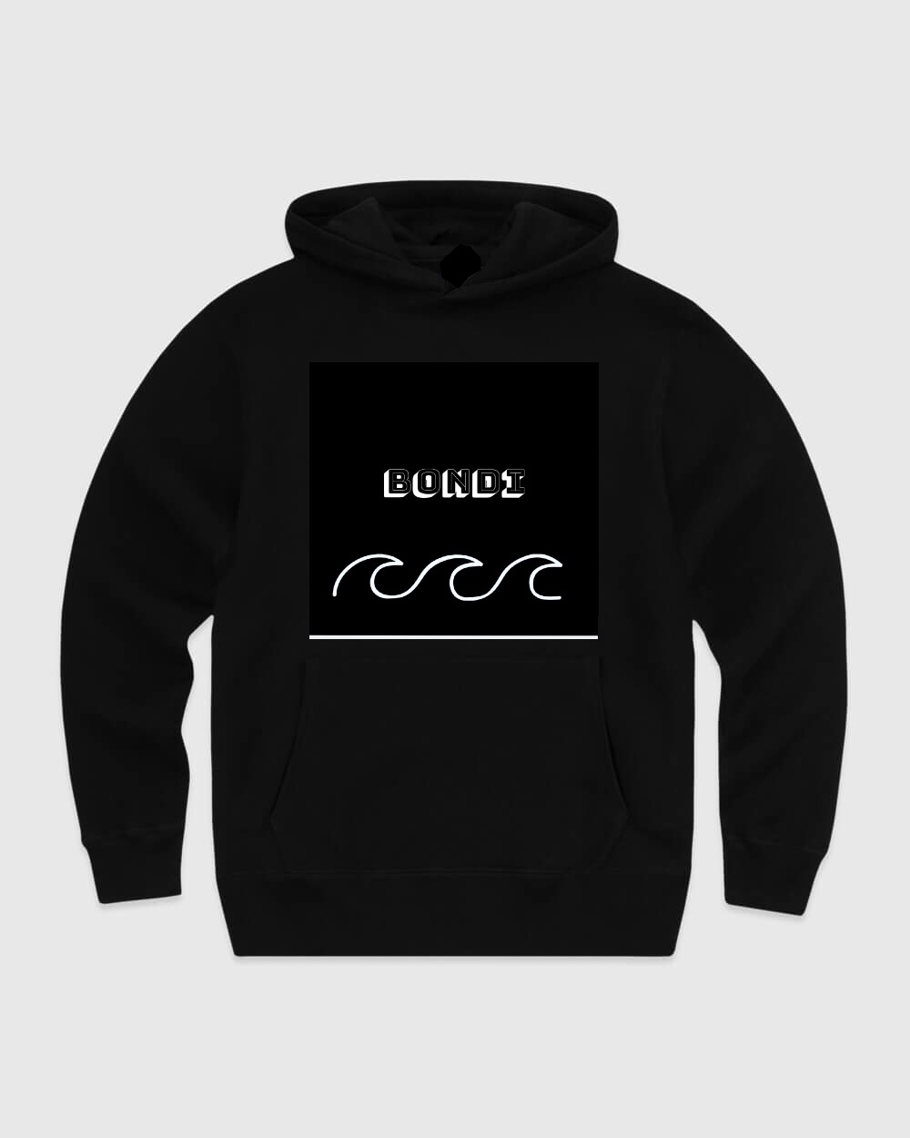
After listening to our assigned song, “Spirits” by the Strumbellas, we agreed that the message of our band would be rebellion and nonconformity. We named our ‘new’ band Bondi, after the beach in Australia, and we decided that our most realistic target audience would be teenagers and young adults (ages 16-25). Younger audiences are usually attracted to indie music, and we thought that our message, nonconformity, would be an effective way to appeal to these listeners. Also, this age group is very tech savvy, so social media was key for marketing the band.
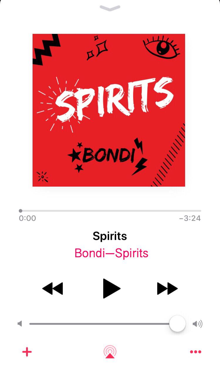
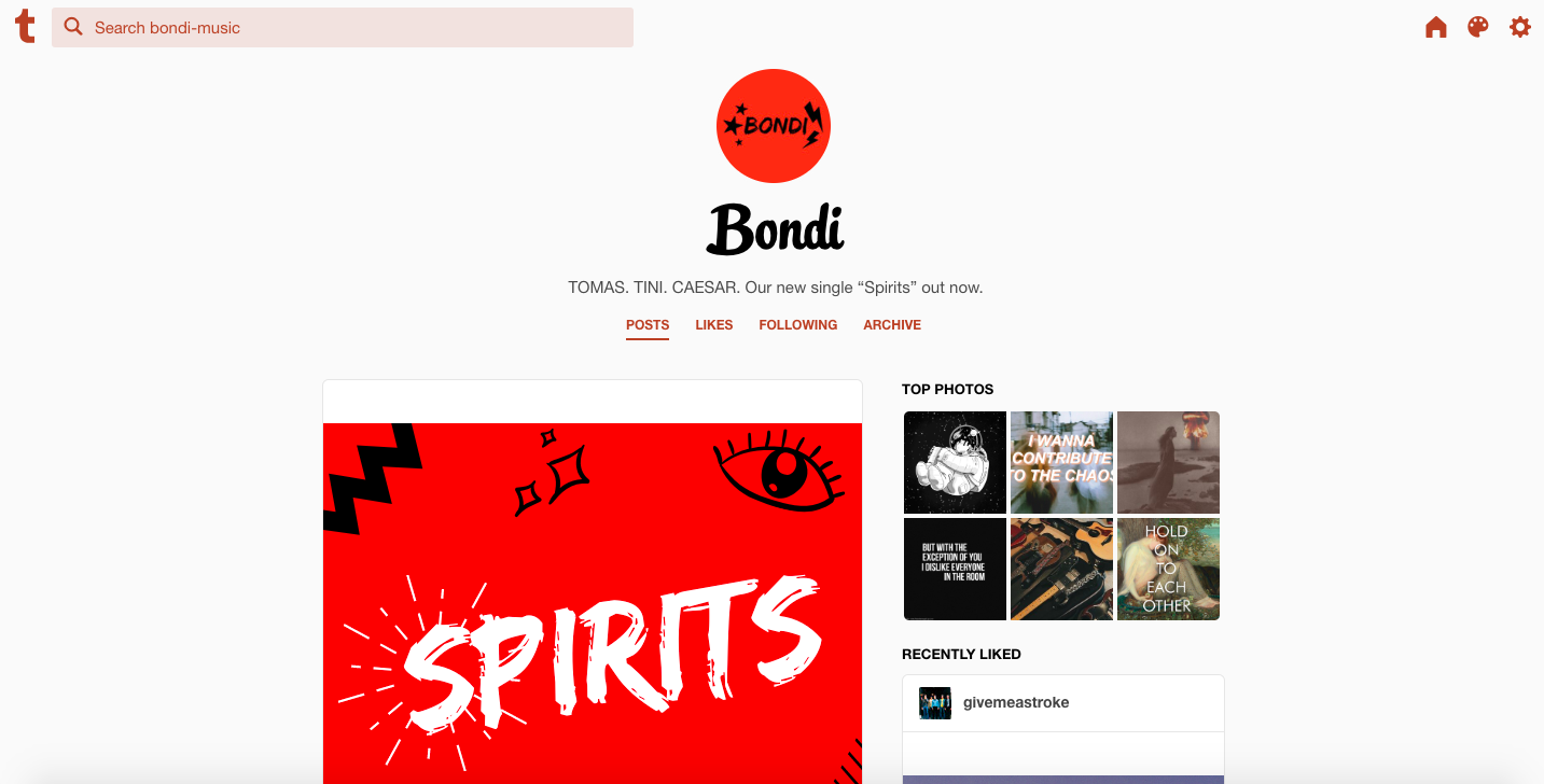
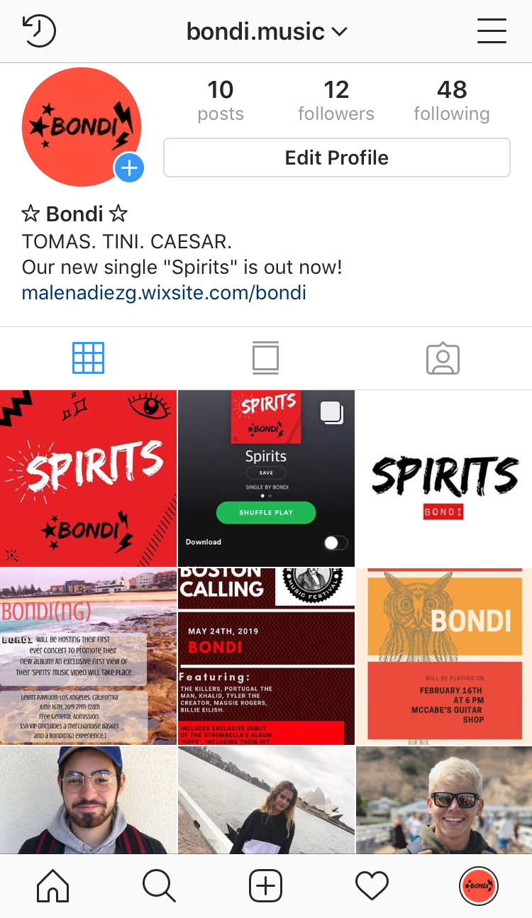
Once we established these factors, we were able to create our campaign based on the image we wanted to create of Bondi. We utilized graphic design apps such as Canva and Superimpose to create Bondi’s logo, single cover, event posters, merchandise, and stickers. In order to maintain the theme of our band, we agreed that our central color scheme would be red, black, and white. Our group decided to create Instagram and Tumblr platforms for Bondi, where we would post images of our band members, event announcements, teaser trailers, and more. We chose these sites because Instagram is one of the most popular social platforms for teenagers and young adults, and Tumblr creates a blog-style account where users can share their favorite music playlists, art, and repost others’ publications. We would also be taking advantage of streaming services like Apple Music and Spotify to distribute our new single. These different platforms would allow us to reach a wide range of audiences and market our music even further.


Single Cover LogoThis month, I was assigned to complete a Music Marketing Campaign along with two other group members. We had to produce a marketing and distribution plan for an up-and-coming indie rock band. This included creating a music video, using technological convergence, performances, and other practices to promote the new band. Once this was done, we would create a presentation and share our campaign to our class (our ‘potential investors’).
Before beginning the campaign, we first had to see how other indie rock bands developed and advertised their music. Our group began to research several bands, including “Florence and the Machine” and “Hozier” to investigate their marketing and distribution trends and how we could implement them in our own project. Both of the case studies informed us that these bands were highly active on social media (such as by posting announcements for new music releases and releasing teaser trailers), so we considered it essential to create a significant social media presence for Bondi. Additionally, both Hozier and Florence and the Machine distributed their music on streaming services such as Spotify and Apple Music. They have also performed at multiple festivals, shows, and concerts. For example, Florence and the Machine played at U2’s 360 Tour and Hozier performed at the 2015 Billboard Music Awards. After investigating these bands, we recognized that it was vital for us to distribute our music on popular streaming services and promote our band at events. This would increase the presence of our music both digitally and in real life.
After listening to our assigned song, “Spirits” by the Strumbellas, we agreed that the message of our band would be rebellion and nonconformity. We named our ‘new’ band Bondi, after the beach in Australia, and we decided that our most realistic target audience would be teenagers and young adults (ages 16-25). Younger audiences are usually attracted to indie music, and we thought that our message, nonconformity, would be an effective way to appeal to these listeners. Also, this age group is very tech savvy, so social media was key for marketing the band.
Once we established these factors, we were able to create our campaign based on the image we wanted to create of Bondi. We utilized graphic design apps such as Canva and Superimpose to create Bondi’s logo, single cover, event posters, merchandise, and stickers. In order to maintain the theme of our band, we agreed that our central color scheme would be red, black, and white. Our group decided to create Instagram and Tumblr platforms for Bondi, where we would post images of our band members, event announcements, teaser trailers, and more. We chose these sites because Instagram is one of the most popular social platforms for teenagers and young adults, and Tumblr creates a blog-style account where users can share their favorite music playlists, art, and repost others’ publications. We would also be taking advantage of streaming services like Apple Music and Spotify to distribute our new single. These different platforms would allow us to reach a wide range of audiences and market our music even further.


Apple Music Spotify
 |
| Tumblr |
 |
 |
| Website |
 |
| Merchandise |
Signing off for now :)
Catalina
Subscribe to:
Posts (Atom)