Sunday, April 7, 2019

Creative Critical Reflection

Hello! Here is my CCR! 
After five days of perfecting the content, editing, and images of the video, I hope you enjoy my final work as much as I do. 


Thanks for reading my blog! 

Bye😊
Catalina

Saturday, April 6, 2019

THE FIT Magazine

Today's the day! After two months of working towards achieving the perfect look for my magazine, its time to unveil my finished product.

I present to you, THE FIT Magazine.
Enjoy!

Please click here for the interactive, flipbook edition of my magazine.

My magazine can also be accessed on Canva. Click here to view!


Thanks for following me along on this journey! I hope you liked THE FIT 😁

Goodbye!
Catalina

Thursday, April 4, 2019

The Final Countdown

       Happy Thursday readers! My final project is due in two days and I'm very excited to showcase the magazine that I've been working on for two months (but it feels like much less)!
       Before I share my magazine though, I'd like to talk about the overall changes that have been made to the magazine as well as reflect upon the production process. 
       My initial idea for my two-page spread was a collage look, but after looking at various examples, my group and I decided that it would be best to go for a cleaner, classic look. I don't regret making this decision; I think it makes the magazine look very elegant and minimalistic. This decision ultimately led me to choose an interview as the subject of my two-page spread because it creates a realistic and enagaging way of informing readers about the model on the cover image, Beatriz Mendes. 
       One major change that I made to my cover was to create the 'shadow' effect for the masthead and coverlines. 


This not only helps them stand out against my cover image but it also adds visual interest to the page. 
        Another modification that my group and I made was to the table of contents. Our initial table of contents looked like this:

However, after reviewing fashion and beauty magazine table of contents examples, we realized that they're usually two or three pages. So, we needed a two-page table of contents for it to have more titles that encompass the entire publication. I'm really glad we realized this because we now have many more articles and pictures on our contents page. This is the finished table of contents:


       In addition, we made our advertisement two pages because one major convention for advertisements in magazines such as Vogue and Harper's Bazaar is that they are usually two pages to catch readers' attention. 
       Throughout the course of the project I made sure that my magazine was maintaining the same look as those of Malena and Valentina. If you would like to view their awesome blogs, click on their names!

       All in all, I'm very proud of my magazine. I learned a lot of photography techniques and graphic design skills, and I further realized the passion that I have for fashion and design. Even though my journey had several ups and downs, I'm thankful for the invaluable time managent and improvisation  skills that I gained. I'd like to thank my amazing group members, Valentina and Malena, for helping to create the look of THE FIT, as well as my teacher, Mrs. Stoklosa, for guiding me through the project. I now have my very own magazine that I'll look back upon for years to come. 


Signing off,
Catalina 

Wednesday, April 3, 2019

The Two-Page Spread Has Arrived

       Hello! Today I’ll be discussing my two-page spread. Yesterday I had no school so I worked all day on my magazine. I finished my cover, table of contents, advertisement, and two-page spread. During this time I made sure that my fonts, sizes, and layouts were all the same as those of my partners.
        As for my two-page spread, unfortunately, I did not have enough time to create the ‘collage’ look that I had imagined for my spread, but I still love how it looks. My group decided to aim for a more classic look, with bold fonts and a limited color palette (white, black, and red). We used the magazine Vogue as our main source of inspiration. For the content of the main article, I decided that it would be an interview with Beatriz Mendes, the model on our cover page. Here is the finished two-page spread:


       For our two-page spreads, Valentina, Malena, and I all have a bold title with a red line on the bottom. In addition, we all decided to make the first letter of the text bolder (the ‘T’) because that’s a typical convention of fashion and beauty magazine articles. On the right-hand page in the top right corner, we all have a small section relating to the article, such as “Beatriz’s Top 5 Favorite Fall Pieces” and “Ways to Wear Val’s Creations”. In addition, we placed a small red box in the corner with the individual or company’s contact information. Also, we used “Bodoni FLF” for the font.
        One resource that was very helpful in creating the design of our magazine was DaFont, a website that has over 40,000 downloadable fonts ranging from classic to graffiti to cursive. Here is what the homepage looks like:


Although Canva has a wide variety of fonts, my partners and I were looking for a more classic, bold font than what was available on the graphic design site. After looking at various fonts, we found the Vogue font and thought it would look great on our magazine cover.


I placed a yellow box around the statement Free for personal use to show that I am permitted to use it for my magazine.
        With this font, we were able to create the masthead and several other components of our magazine. For example, we used this font for the text, “THE FIT”, next to the page numbers on each page.
       Overall, I’m very proud of how this turned out and I can’t wait to reveal my cover! I will be revealing my entire magazine soon :-)

Stay tuned!
Catalina

Tuesday, April 2, 2019

Ad Time!

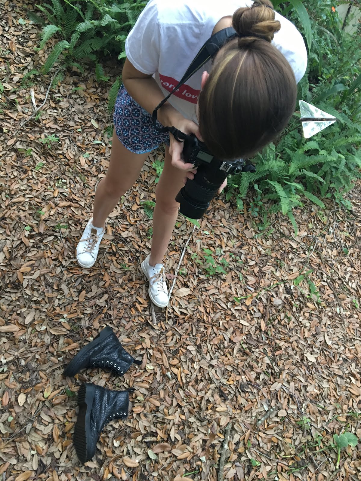
Happy Tuesday! Today was another successful day in my production process. Yesterday, when I was taking the pictures for my table of contents, I also set up the picture for my ad (the draft of which is posted in a previous blog post). It's going to be promoting a monthly beauty subscription bag, similar to Ipsy and Birchbox. Here is my set-up:


Again, I used the Nikon D90 Camera and a ring light. Here are some (unedited) pictures that I took:


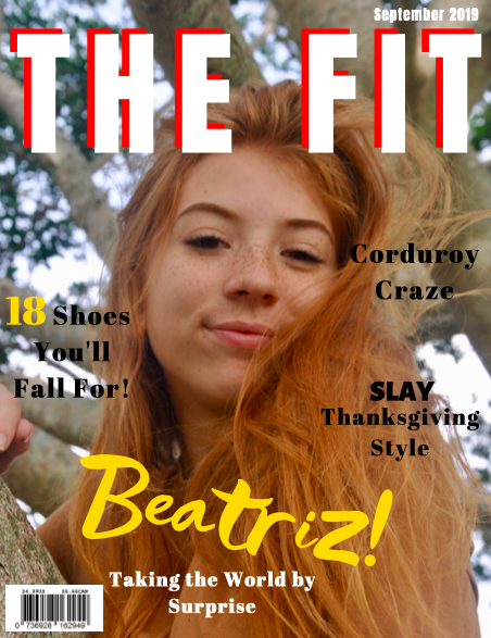
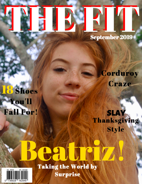
After looking at all of the pictures, I chose the one that I believed looked best, increased its exposure, and increased the saturation. Here's how it turned out:


I placed this image on Canva, where I created the brand's logo and inserted a short description including the website. After researching several beauty subscription services, their average price is $10 per month. This is the cost that I plan on placing on the subscription. 


Overall, I'm very satisfied with how it looks! I really enjoyed arranging the makeup products, taking pictures, editing the photo, and creating the graphics. 

Stay tuned for tomorrow's progress!
Catalina 

Monday, April 1, 2019

Tic TOC


        Hi! It’s almost time- my magazine and CCR are due in six days! I’m a little stressed out because there’s so much to be done- I have to finish up my magazine, create a script for my CCR, and record my CCR. As for today, I was determined to finish taking pictures for my table of contents (TOC). Fortunately I was able to accomplish my goal in just a few hours. I looked all around my house for fall fashion items, and since my mom’s closet is jam-packed with all kinds of clothing, that’s the first place I looked. I found a brown leather crossbody bag with small flowers that looked perfect and I also found some black snakeskin combat boots and animal-print sneakers that would fit my theme well. In addition to these fashion items, I wanted to also have a beauty-related picture in my TOC, so I searched for a unique product that I could include. I found a box full of essential oils that I thought would look great on the page! I also searched through all of the nail polishes that I had in a cabinet and I found around eight fall colors. (Big thanks to my mom for lending me all her things).
       Once I had all of these items in hand, I went to my backyard and had a mini-photoshoot with the bag and boots. I tried out different backgrounds, different lighting, on the floor, on a tree, on a model, everything. For the bag, I asked my sister Malena if she could wear it with a fluffy sweater so I could take pictures of it. While taking pictures I found that there was a really nice shadow of branches across her body, like so: 

I thought added interest to the picture and also made it even more ‘fall-looking’. I also asked Malena to hold the bag with both hands to see how it would look in the picture: 


After this, I took many, many, many pictures of the combat boots and animal-print sneakers. You’d be surprised at how many different ways you can arrange just two pairs of shoes! I layed them out on the ground where there was a big patch of leaves. Here's a  picture:

I really liked how the combat boots looked, so I took a few pictures of them alone. I also propped one shoe on the branch of a tree and had a little photoshoot there too. If anyone saw me taking a picture of the boot in the tree, they probably thought I was crazy. But you gotta do what you gotta do for your AICE Media Project! Take a look at some shots that I got:


Here’s me taking pictures:


After this was done, I moved my photoshoot indoors to take pictures of the essential oils and nail polishes. Since I didn’t have a big white background, I just used regular white printer paper to lay the nail polishes on it. Used a ring light and a camera (Nikon D90) to get the highest quality pictures that I could. This was my setup:


I tried so many different arrangements and angles for the nail polishes. I also painted a small dash of the polish near the bottle for each one. Here are some pictures:


For the essential oils, I decided that the photograph would look more appealing if I had a more natural background. Since the oils were in a wooden box, a chose to have a light wooden background. This also coincided with my fall theme. I think the pictures turned out great! Here they are: 


After this was all said and done, I looked at all of the pictures on my laptop and found the best ones for my table of contents. I moved them onto Canva and assorted them into a square shape on the page. I wasn’t able to include the nail polish picture, which I’m sad about, but overall I really like how it looks. I also created several titles to go along with the pictures. Here is my table of contents so far:


My group decided to go for a more ‘Vogue’ theme: an elegant and simplistic look. We decided that the font would just be black and that our pictures would add color to the page. No other color other than black was used for the font because we didn’t want it to detract from the colorful images. I’m super proud of my work and I can’t wait to continue working. 

Thanks for following along with my productive day! I know tomorrow will be just as successful.


Until then!
Catalina

Sunday, March 31, 2019

Cover Craze!

       Hello! I’ve been working on a few different ideas for my cover. I’ve researched many fashion magazines so that I could follow genre conventions, such as barcode placement, masthead placement and font, dateline placement, number of coverlines, etc. I’ve also tried to maintain a fall color scheme within my cover. Here are some drafts that I made with Canva:

The masthead font is Anton, which I like the boldness of. I really like the messy look of the font that I used for the word “Beatriz”, and the bright yellow color helps catch readers’ attention. However, it might be a little risky since it’s very ‘out-there’. One part of this cover that I dislike is that I think I used too many different fonts. I’ll be sure to limit the number of fonts to two, which I think will make the cover look neater. I made the number on one of the cover-lines yellow to make it stand out, and bolded the word “Slay” in another coverline as well. I placed the dateline at the very top of the page, but I’m not sure if it’s the best choice. Overall a nice cover but it needs a few modifications. 


For this cover, I kept the same font for the masthead, but the main cover line is in a more traditional font, called Abril Fatface. I’ll discuss with my group members whether we should have a basic font for the main cover line or whether we could implement a more eye-catching font, as I did with the previous cover. I moved the date line for it to be under the masthead, so that I could have options for when I finalized its placement.


This cover is very similar to the previous one. I changed the masthead font to Abril Fatface just so that I could see what the cover looked like with one homogenous font.


I went back to Anton font for the masthead, but I changed the coverlines’ font to Alegreya Sans Black so that I could have a bolder font to help the coverlines stand out more. I left the main cover line in Abril Fatface, and I made the word “Slay” in one of the coverlines a dark purple just to make it stand out a little more. I also placed the dateline at the bottom left corner, now in black. Looking back, this also has too many different fonts in my opinion, so I’ll be sure to make a change soon.

       Even though the font Abril Fatface does align with typical fashion magazine font conventions, I don’t think it’s the best choice because it’s not bold enough for the coverlines. Moving forward, I think I will keep the Abril Fatface font for the main cover line and masthead, but make the cover lines a different font.
       Overall, I’m between the first and third cover lines. Right now it’s a little bit of a mess of fonts and colors, so I hope that after discussing with my group we can get a clearer picture of what looks best.
       Tomorrow is the first day back from spring break, and I’m feeling a mix of emotions. I’m happy to have face-to-face contact with my group members again so we can finish up our magazines, but the break was really fun and relaxing. But all good things must come to an end, so now it’s time to make the best magazine I can!

Thanks for reading,
Catalina