As for my two-page spread, unfortunately, I did not have enough time to create the ‘collage’ look that I had imagined for my spread, but I still love how it looks. My group decided to aim for a more classic look, with bold fonts and a limited color palette (white, black, and red). We used the magazine Vogue as our main source of inspiration. For the content of the main article, I decided that it would be an interview with Beatriz Mendes, the model on our cover page. Here is the finished two-page spread:

For our two-page spreads, Valentina, Malena, and I all have a bold title with a red line on the bottom. In addition, we all decided to make the first letter of the text bolder (the ‘T’) because that’s a typical convention of fashion and beauty magazine articles. On the right-hand page in the top right corner, we all have a small section relating to the article, such as “Beatriz’s Top 5 Favorite Fall Pieces” and “Ways to Wear Val’s Creations”. In addition, we placed a small red box in the corner with the individual or company’s contact information. Also, we used “Bodoni FLF” for the font.
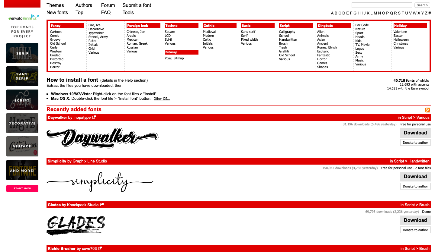
One resource that was very helpful in creating the design of our magazine was DaFont, a website that has over 40,000 downloadable fonts ranging from classic to graffiti to cursive. Here is what the homepage looks like:
Although Canva has a wide variety of fonts, my partners and I were looking for a more classic, bold font than what was available on the graphic design site. After looking at various fonts, we found the Vogue font and thought it would look great on our magazine cover.

I placed a yellow box around the statement Free for personal use to show that I am permitted to use it for my magazine.
With this font, we were able to create the masthead and several other components of our magazine. For example, we used this font for the text, “THE FIT”, next to the page numbers on each page.
Overall, I’m very proud of how this turned out and I can’t wait to reveal my cover! I will be revealing my entire magazine soon :-)
Stay tuned!
Catalina
No comments:
Post a Comment