Cover Craze!
Hello! I’ve been working on a few different ideas for my cover. I’ve researched many fashion magazines so that I could follow genre conventions, such as barcode placement, masthead placement and font, dateline placement, number of coverlines, etc. I’ve also tried to maintain a fall color scheme within my cover. Here are some drafts that I made with Canva:
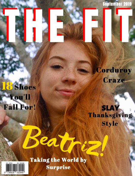
The masthead font is Anton, which I like the boldness of. I really like the messy look of the font that I used for the word “Beatriz”, and the bright yellow color helps catch readers’ attention. However, it might be a little risky since it’s very ‘out-there’. One part of this cover that I dislike is that I think I used too many different fonts. I’ll be sure to limit the number of fonts to two, which I think will make the cover look neater. I made the number on one of the cover-lines yellow to make it stand out, and bolded the word “Slay” in another coverline as well. I placed the dateline at the very top of the page, but I’m not sure if it’s the best choice. Overall a nice cover but it needs a few modifications.

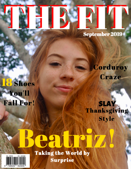
For this cover, I kept the same font for the masthead, but the main cover line is in a more traditional font, called Abril Fatface. I’ll discuss with my group members whether we should have a basic font for the main cover line or whether we could implement a more eye-catching font, as I did with the previous cover. I moved the date line for it to be under the masthead, so that I could have options for when I finalized its placement.
This cover is very similar to the previous one. I changed the masthead font to Abril Fatface just so that I could see what the cover looked like with one homogenous font.
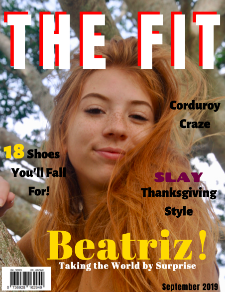
I went back to Anton font for the masthead, but I changed the coverlines’ font to Alegreya Sans Black so that I could have a bolder font to help the coverlines stand out more. I left the main cover line in Abril Fatface, and I made the word “Slay” in one of the coverlines a dark purple just to make it stand out a little more. I also placed the dateline at the bottom left corner, now in black. Looking back, this also has too many different fonts in my opinion, so I’ll be sure to make a change soon.
Even though the font Abril Fatface does align with typical fashion magazine font conventions, I don’t think it’s the best choice because it’s not bold enough for the coverlines. Moving forward, I think I will keep the Abril Fatface font for the main cover line and masthead, but make the cover lines a different font.
Overall, I’m between the first and third cover lines. Right now it’s a little bit of a mess of fonts and colors, so I hope that after discussing with my group we can get a clearer picture of what looks best.
Tomorrow is the first day back from spring break, and I’m feeling a mix of emotions. I’m happy to have face-to-face contact with my group members again so we can finish up our magazines, but the break was really fun and relaxing. But all good things must come to an end, so now it’s time to make the best magazine I can!
Thanks for reading,
Catalina
No comments:
Post a Comment