This first layout from Harper’s Bazaar Magazine is very appealing and is mainly about beauty. I love the ‘collage’ look that it has, as I planning on creating this type of design as well. The creators did a great job at overlapping different images of models and beauty products, as well as including ‘smears’ of blush or cream to achieve a ‘messy’ look. This two-page spread has the perfect amount of text in my opinion; readers are often more enticed by the images than the actual text itself. You now what they say… an image is worth a thousand words! Each picture contains a short description of the product shown, including the brand and price. This is important to note for my own two-page spread. This is a great two-page layout that I plan on taking inspiration from.

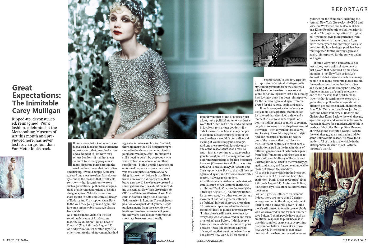
This two-page spread from Elle Magazine has a more classic and clean look. The title ad a short description are placed on the side of the article, which draws more attention to them. I find the blue theme very attractive, so I’ll definitely be incorporating a warm-toned look in my own two-page spread. I like that the magazine didn’t overload the spread with two many images, but I feel as if there is too much text. I think that they should shorten the article and include more graphics to make the layout more visually engaging. It is highly organized and simplistic, so I’ll be drawing a little inspiration from this magazine spread as well.
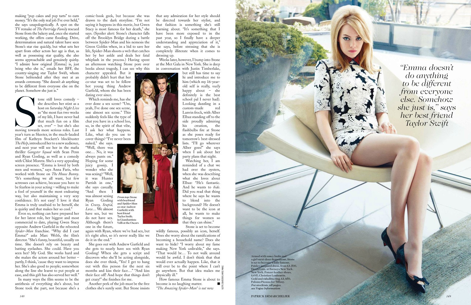
This two-page spread layout from Vogue Magazine has mainly all of the text on the left-hand page, and the central image on the right. I like how it included a short quote on top of the image; I think it makes it more engaging for the audience and draws attention to the quote. I like how they also included small pictures of the model within the article, so as not to have an overabundance of text. Although this layout looks very clean and elegant, I don’t think this is the look I’m going for. I’d like to have more, smaller images all throughout the pages, with text on both pages as well. However, I do like the capitalized letter to indicate the start of the article. I’ll probably be including this feature in my own spread.
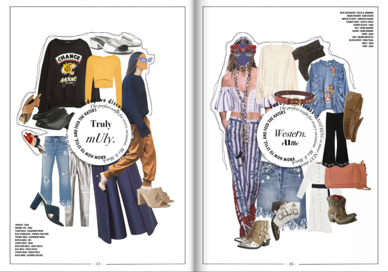
Lastly, this layout reminds me of a mood board in that it has different themes for each outfit. I plan on basing my own two-page spread in examples like these, which are collage-like and very pleasing to the eye. However, since this spread is probably a part of a larger article within the magazine, it does not include much text. One idea that occured to me was creating this design on one page and then having text and small images on the other page. In addition, since my magazine will include fashion and beauty, I will create a collage with both clothing and makeup products. I also really like the different kinds of fonts and sized arranged in a circular pattern on the pages. As long as it does not look confusing, I’d like to implement this in my own layout as well.
Thanks for reading! Goodnight!
Catalina
Image Citations (in order of appearance):
Vaughan, K. (2012, October 22). Double Page Spread Fashion Magazine. Retrieved March 9, 2019, from http://kirbyvaughan17.blogspot.com/2012/10/double-page-spread-fashion-magazine.html
Yao, Y. (2014, January 5). ELLE Fashion Magazine Design (Layout). Retrieved March 9, 2019, from https://www.coroflot.com/yingyao/ELLE-Fashion-Magazine-DesignLayout
Alegator Dedreapta. Vogue Magazine Spread. Retrieved March 9, 2019, from http://alegatordedreapta.info/marvdwn-vogue-magazine-spread.awp
Design School. (2016, February 8). How to Design a Fashion Magazine Like Vogue. Retrieved March 9, 2019, from https://blog.flipsnack.com/how-to-design-a-fashion-magazine-like-vogue/
No comments:
Post a Comment