I really like this table of contents from Latina Magazine. It’s organized into four different topics: Be Beautiful, The Good Life, All Access, and The Latin Kitchen. This organized look allows readers to instantly know where to look for their favorite content, which is essential for a contents page. They kept the text simple: a classic white font that contrasts from the colorful images surrounding it. I love how they included short descriptions under each title to describe what each article will be about. I also really like how they implemented pictures, paired with page numbers, on the page to show a ‘sneak peek’ of different articles within the magazine. This enhances the look of the table of contents without making it seem too cluttered. One other aspect of the table of contents is the page on the right of it: an advertisement. Fashion magazines often pair an ad with their table of contents since they know many of their readers will flip to that page to look for certain articles. I plan on placing an ad next to the table of contents since it’s an important characteristic of fashion magazines.

Next, this table of contents from Vogue Magazine has several important aspects that should be addressed. First, I don’t really find the small font that’s used to show each story in the magazine very appealing. I think they tried to fit all of the titles on one page when they should have made a two or three-page table of contents to achieve a more reader-friendly look. Nevertheless, each title is placed under a specific category, so it does have a comprehensible organization. I also really like the sophisticated look of the page. The elegant red font of the magazine’s title superimposed with the basic black font of the edition’s month looks very appealing to me. It is not highly elaborate but achieves the perfect look that epitomizes the magazine itself. This is what I would like to achieve: a magazine that has the same underlying theme across all aspects: the cover, table of contents, and two-page spread. (Fingers crossed!) One downside is that there’s only one image on the page, which is less engaging than the six different images in the Latina Magazine page. Thus, I plan on including several images in my table of contents to better engage my audience.

This table of contents from Impact Magazine has both a minimalistic and engaging look. Even though I’m going to make my table of contents one page, this two-page layout looks very clean and organized. The articles are placed in ascending order based on their page number, and I really like the short descriptions under each article. The unique shape of the images (which are either photographs or cartoons) gives the layout an artistic look that is highly appealing. These images correspond with the article title that is below it, such as “Death, Thy Name is Streaming” under the image of the Spotify and Soundcloud logos. Overall, there are no drawbacks to this layout in my opinion; it has a simplistic design that is enhanced by the five colorful images shown.

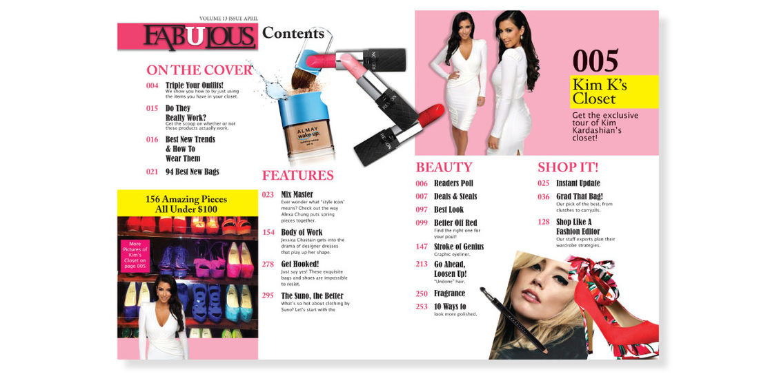
This page from Fabulous Magazine does a great job at implementing both fashion and beauty products in the table of contents. This is one feature that I would like to have in my own contents page since my magazine will have fashion and beauty content. If I only have articles of clothing or only have beauty products, the page won’t fully represent my magazine. One small detail that I thought was interesting was that the table of contents had zeros in front of the smaller page numbers in order to always have three digits in front of the article titles. I believe this was done to show that the magazine had hundreds (000) of pages. Since my own magazine will probably not reach one hundred pages, I could have two-digit page numbers (example: 06, 09, 17, 32) to maintain a uniform look. However, I don’t really like the images in the bottom left of the left page and the top right of the right page. I think they look artificial and do not flow well in the layout. Despite this flaw, I think this is a great table of contents.
This definitely helped me decide upon my own idea for the table of contents. Thanks for following along! Be back soon,
Catalina
Image Citations (in order of appearance):
Flickr. (2017, September 12). 2015 Table of Contents & Garnier Fructis Flatiron Express Brazilian Smooth Hair Conditioner, Latina Magazine (2 pages). Retrieved March 8, 2019, from https://www.flickr.com/photos/29069717@N02/36354967374/in/photostream/
Stopa, L. Vogue Magazine. Retrieved March 8, 2019, from https://app.emaze.com/@AWFWCWWW#21
Kingan, K. (2016, September 30). Table of Contents- Impact Magazine. Retrieved March 8, 2019, from https://www.behance.net/gallery/43414647/Table-of-Contents-Impact-Magazine
Leigh, A. Fabulous Magazine. Retrieved March 8, 2019, from http://www.austinleighdesign.com/fabulous-magazine.html
No comments:
Post a Comment