My group and I found a way for our masthead to stand out!! On Canva, there was no option to place a dark border around the letters, so we made two copies of the masthead. One copy would be white, and the other would be a bright color, like red. We placed the white copy at the front, and the red copy behind it as if it’s a shadow. Here’s how it looks with a few different fonts:
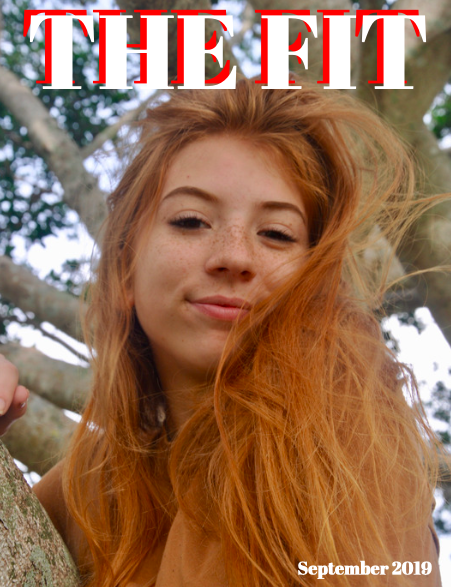
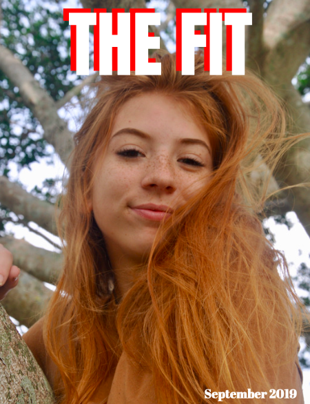
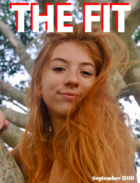
I really like this concept we can all have this ‘shadow’ effect but with a different back color. For example, we can all have white as our ‘front’ color, and I can have red, Valentina can have pink, and Malena can have blue as the ‘back’ color. This will allow us to have the same look and layout but with a few different details. I also really like the font in the second image.
Hope you enjoyed!
Catalina
No comments:
Post a Comment