Wednesday, March 20, 2019

Take a Look Behind the Scenes!

       Hello! Today I’ll be showing you a behind the scenes look at our photo shoot at Markham Park and I’ll explain some of the problems that we encountered as well as how we solved them.
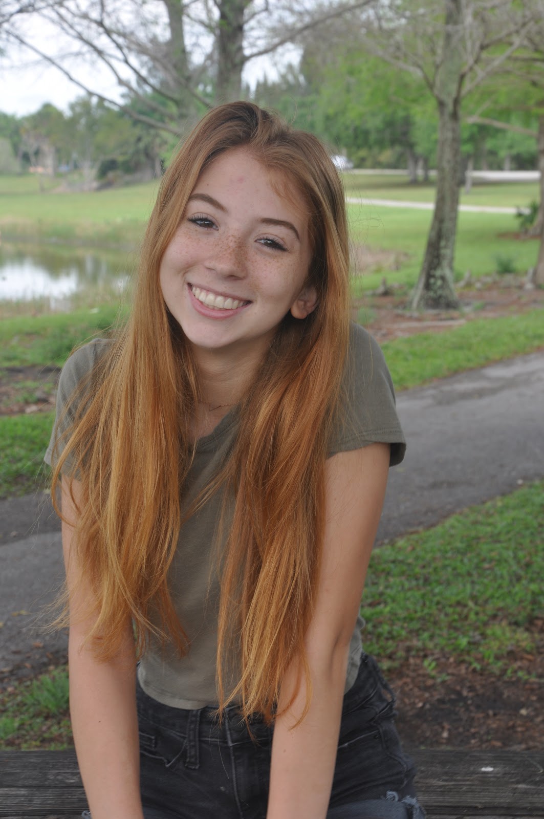
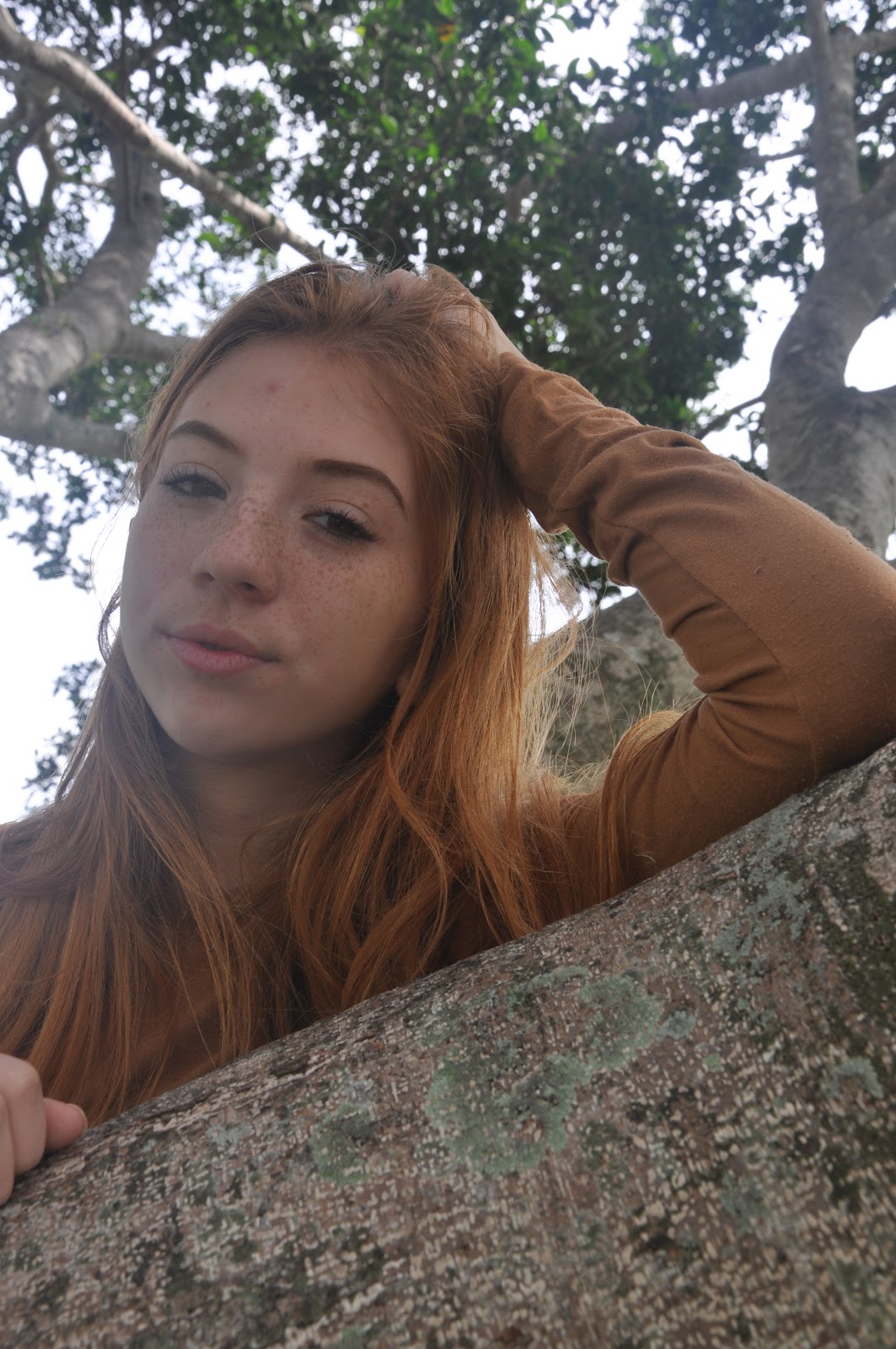
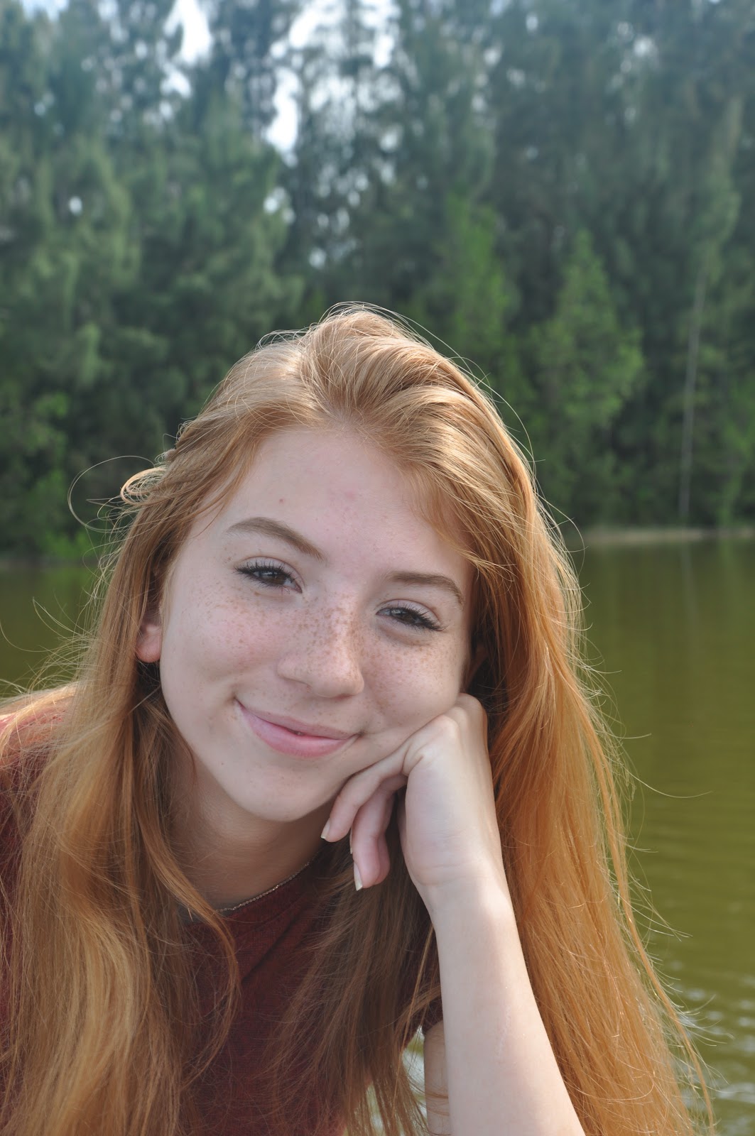
       First, the day was a little cloudy so I was worried that the lighting may have been low, but it wasn’t! I think the lighting turned out great. I’m really impressed at how much the camera helped make the pictures high-quality and detailed. Another conflict that we had was that we weren’t sure how the model could pose without looking awkward. Fortunately, we used a tree as a prop! There was a wooden table under the tree, and our model was able to stand on it so she was surrounded by tree branches. This added visual interest to our pictures and helped the model look a little more natural. Here’s some shots of me taking pictures of Beatriz, our model:

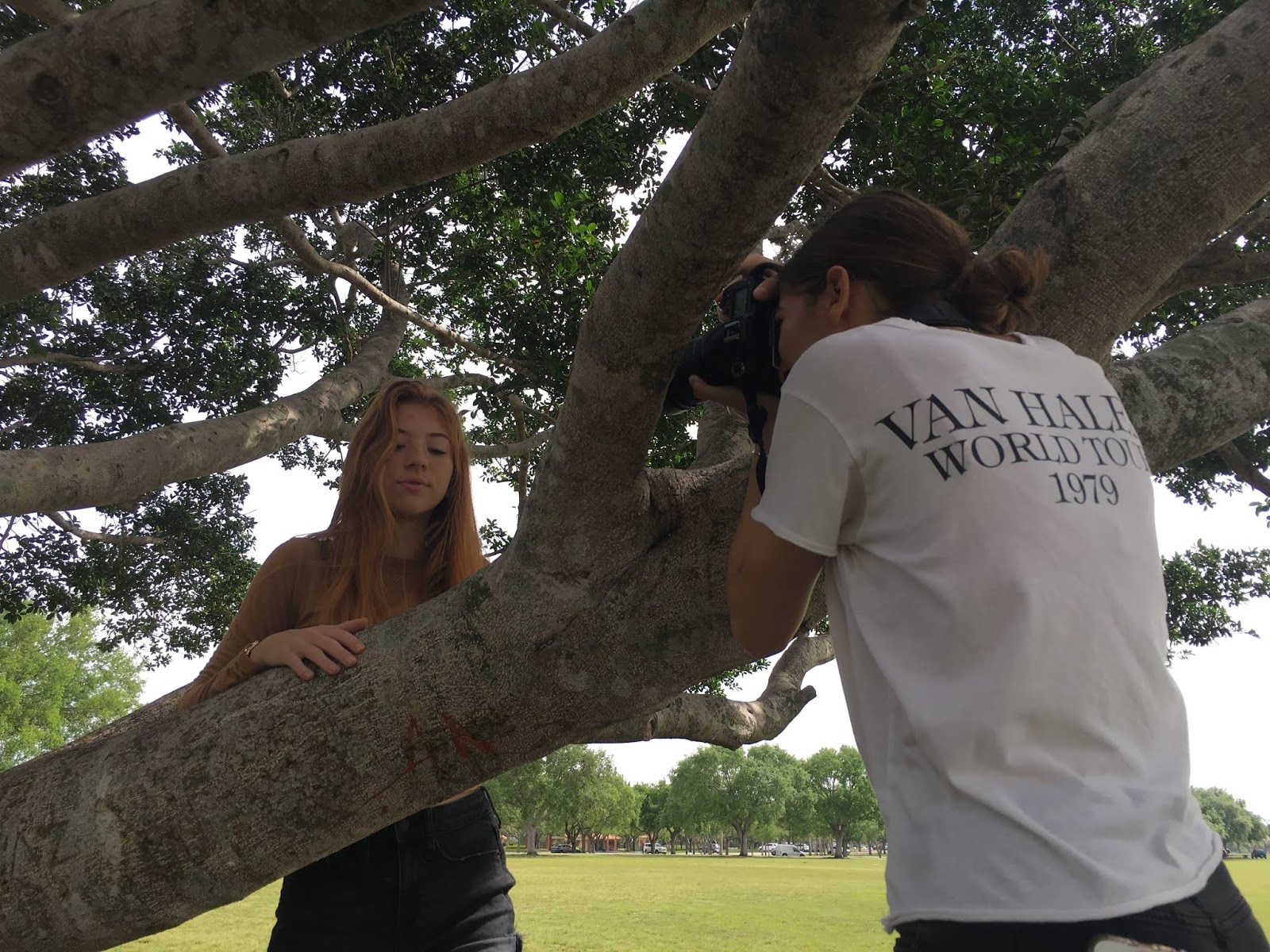


         As you can see, I was positioned on top of a tree branch so I could get a stable picture. I’ll admit that I looked a little weird but it’s worth it if I’ll get a great picture! At first I took a few shots with the tree branches in front of Beatriz, like the first picture, but then I moved closer to her. I asked Beatriz to make different facial features, pose in different ways, and move her hair so as to have the a lot of options. I took as many photos as possible because the perfect pose or look could disappear in an instant.
       After taking several pictures I realized that a low angle really enhances the image. A small issue that we had was that Florida weather + warm clothes = not fun. Beatriz was little uncomfortable wearing a sweater for a long time because it was so hot! Luckily I tried taking the pictures quickly or we took pictures under the shade so she didn’t hate me :-)
       Overall the photo shoot went smoothly! I’m glad I have my cover image (which is coming soon) and some pictures for my two-page spread.

Stay tuned!
Catalina

Sunday, March 17, 2019

Did Someone Say Photoshoot?


       Hello! Today is the day! THE PHOTOSHOOT!
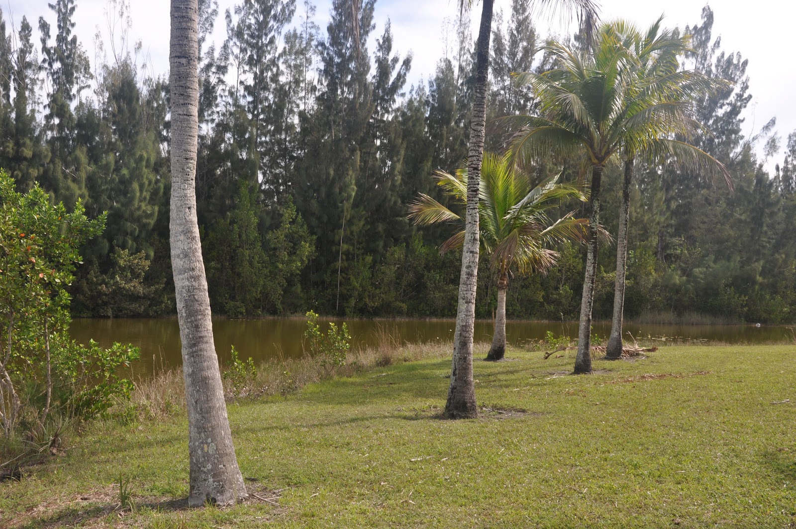
       My sister and I drove to Markham Park, where we met up with Beatriz. We drove around looking for cool spots to take pictures at, and Markham Park did not disappoint. The place doesn’t look like it’s in Florida; there’s so many pine trees and lakes! It wasn’t hard to find our first location with a tree, a few tables, and a lake in the background. Here’s a picture of it:


       We took some shots near the tree, under the tree, on the tree, far from the tree, and everywhere in between. We also took a few of Beatriz sitting on top of the wooden table and standing in the middle of the field as well. It was a little cloudy today but the lighting on the pictures still turned out great. Here’s a sneak peek:


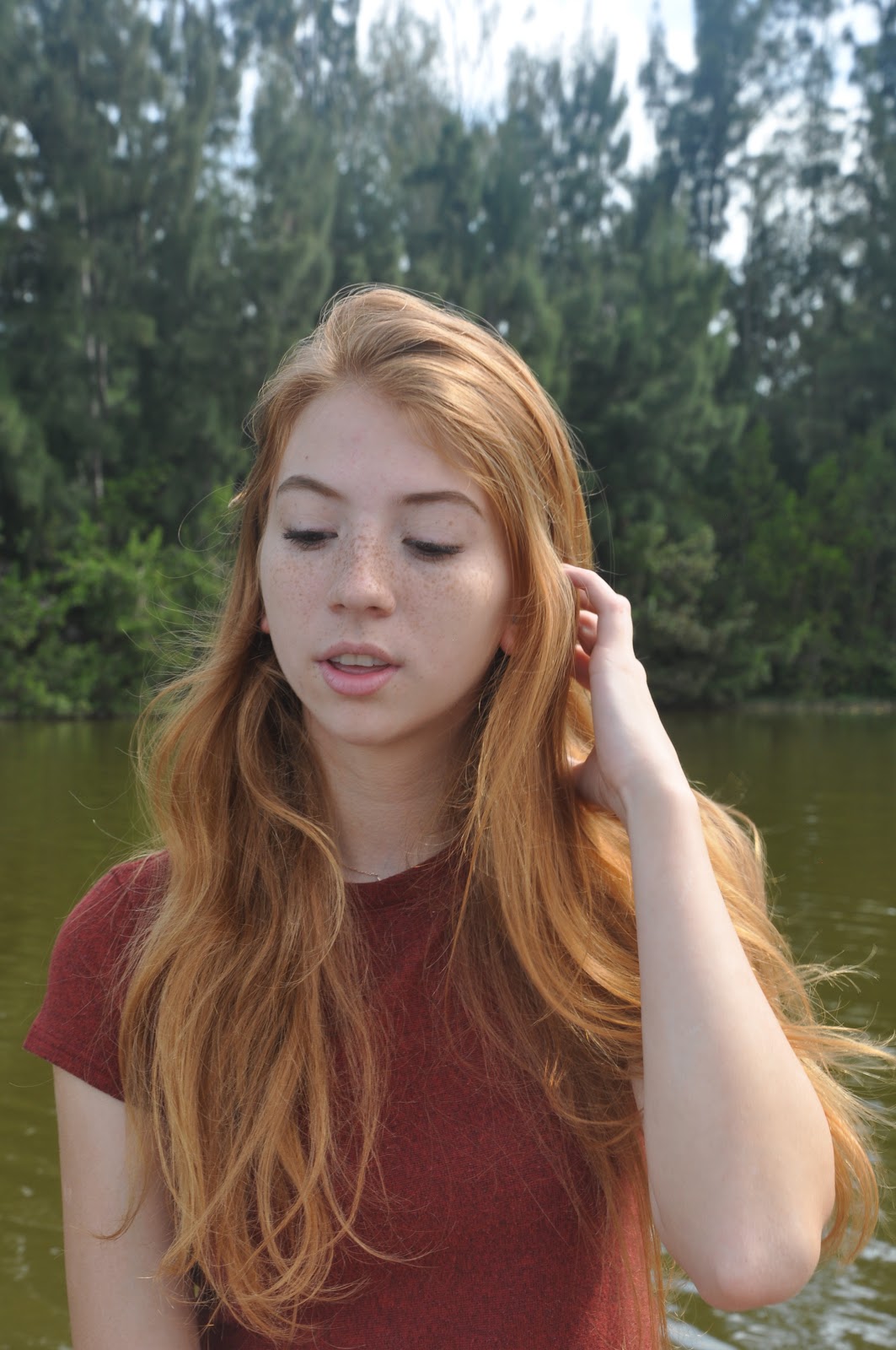
Next, we went to a nearby dock. Here’s a picture of the area:


I took most of the pictures either on the dock or near the shore of the lake. Here’s a few:


Lastly, we did a quick stop at the Butterfly Garden for some final pictures. Here’s where they were taken:


Here’s one picture in particular that I really liked the compositon of:


       We did several outfit changes so that we could have a variety of fall outfits for the magazine. For each of my pictures, I left space at the top so that when I placed the masthead, it would not cover Beatriz’s face. I also left space on the sides of the model for the coverlines. While I was taking pictures, my sister was nice enough to take some behind-the-scenes pictures as well.
       Just for fun, I’ll include a few pictures of Beatriz’s dog, Kibi, who was the true star of the photoshoot:


       I’m really glad with how all the pictures turned out! I took 423 of them, so it’s hard to find the perfect one for my cover. I think I found it though! I haven’t shared it with you yet because I want to be sure that its ready for the big reveal. For now, I’ll leave you with this little clue: the tree is key :-)
       Here’s some blog posts that are coming soon: behind the scenes pictures/footage of the photoshoot, editing the pictures, article ideas, pictures for the table of contents, photoshoot of the clothes, making the collages, draft cover layouts, choosing fonts, the cover image reveal, and much more.

Addio!
Catalina

Saturday, March 16, 2019

Production Planning

        Hi! So I've found a model for my magazine! Her name is Beatriz, she seventeen years old and has orange hair and freckles. I decided that she would be my model because she's very natural on camera and has an eye-catching appearance. I asked her through text message on Wednesday whether she'd be willing to meet up one day to take some cool pictures, and she said yes! We're scheduled to meet up tomorrow (Sunday) at 9:30 AM at Markham Park, where we'll begin our photoshoot. Not only is she willing to model for my magazine, but she's bringing her dog along as well!
        I hope the pictures look professional. I have around 3-4 locations in Markham Park where I can take them, including the Butterfly Garden and Disk Golf course in the forest. My friends and I discovered these places while Geocaching (if you’re not familiar with this activity, it’s basically like a real-life scavenger hunt), and ever since then I’ve been wanting to take pictures there. Here’s my chance! And don’t worry, I'm bringing along my poor sister to take behind-the-scenes pictures of the photoshoot, so you won’t miss out on all the action!
        I asked Beatriz to dress in a dark red, green, or orange shirt so that it will coordinate with my fall theme. I will bring the rest of the outfits: some jackets, sweaters, and accessories should be enough. I’ll mainly be focusing on getting the perfect close-up/mid-shot of Beatriz for my front cover, but I’ll also be taking some long-shots for my two-page spread. Also, my mom taught me how to use her camera, which is a Nikon D90, so I’m all set for tomorrow!

        On March 21st I’m traveling to Argentina to visit my family for spring break. Because of this, the time that I can dedicate to working on my magazine will be limited over the break. However, since I will try my very best to at least get my pictures taken before leaving, I can have something to work with while on the 9-hour plane ride. My group will finalize the layout and font of our magazines so we can all create magazine that have a uniform look. I’d rather not edit the magazine on my phone, so I pulled out my old iPad from under my bed to see if I can bring it on the trip, download Canva, and work on the magazine on a much larger screen. Fingers crossed that all of these things can happen! If all goes as planned and I finish the magazine by April 1st, then I can have around one week to work on perfecting my CCR.

I’ll let you know how the photoshoot goes! I have a good feeling about tomorrow :-)


Adios!
Catalina

Friday, March 15, 2019

Fall Fashion Forward

        Happy Friday!! Today I'll be showing some of the prototype fall outfit ideas that I created with a website called "Shop Look". Before discussing them, I will mention that these are NOT the images I will be using. First, because some of the products' brands are showing, and second, because the images of the clothing were not taken by me.
        For the clothing below, I was mostly experimenting with the different functions of the website, so I looked for outerwear, pants, shows, bags, and accessories. I will not be using this exact image for my own magazine, but I love how this layout turned out and it will definitely give me some inspiration for how my own outfits could look. It also helped me further establish my color scheme: lots of red tones, grey, black, dark/military green, and possibly animal print.


       This next outfit is something I would definitely wear, any day of the year. Unlike the prior image, this shows one single outfit with four different items in it. This is the ideal look that I am planning on making for my own images. I definitely plan on placing things ‘tilted’ on the page and overlapping one item over the other. I think this will create a more unique and appealing look in not only my images, but in my overall magazine.


        Now I will address how I’m planning on making my own outfit and ‘collages’. First and foremost, I am currently working on collecting several pieces of fall clothing that I own, such as jeans, boots, jackets, sweaters, skirts, purses, etc. I must make sure that the brand of these items is not visible so that I do not infringe copyright. Secondly, I have a big white board that I can use to lay my outfits on for it to serve as a background. I also have a ring light and camera, so I have to do some research on how to take the pictures so that they have the best lighting and don’t have shadows.
       Once all of these pictures are taken, I can upload them onto either Superimpose or Shop Look. I have experience with Superimpose so I know that you can overlap different images to make the outfits look visually appealing, but I’d also like to experiment with Shop Look a little more to see if I could create my outfits on that platform. I plan on creating 4-5 outfits. Each outfit will have a different theme, such as casual, formal, ‘night-out, etc. These will be placed across my two page spread, which I believe will be an article about a fashion expert giving advice for outfits for different occasions or styles. In addition to these images, I will probably add a few pictures of a model wearing fall clothing to give the spread a more realistic look.
       One worry that I do have is that the prototype fall outfits are based too much on my own personal style. This could limit the variety of styles that I have in my magazine. In order to combat this, I will review the outfit choices with not only the members of my group but also with my friends, who all have different styles (preppy, bohemian, sporty, chic, classy), to see if they find the outfits that I made appealing.

I''ll be back soon!
Catalina 

Thursday, March 14, 2019

Group Meeting Feedback

Happy 'Pi' Day! Today I was able to meet with four other classmates to review some of the newest developments for my magazine. They gave me great advice on how to carry out my production process and voiced their support for many of my ideas. I also learned a lot from giving constructive criticism to the members about their own projects. All of the students in my group were creating a film-opening. They had great, unique ideas, but in order for their storyline to be clear and engaging, they needed to effectively present their plot by using genre conventions, a setting that fit their film, and props that clearly contributed to the story. Although making a film-opening is different from creating a magazine, giving this advice to others showed me that there is a connection between the two: time-management and patience. Without these two skills, all of our projects will most likely not be successful. (*Note to self: Don’t procrastinate! Make sure you have ample time to reshoot some outfits and edit my layout so that I can get just the perfect look for my fall fashion magazine*).
The members enjoyed viewing my blog and thought that my post about locations gave great examples for where I could take photographs. They mentioned that I should consider taking my pictures with a professional camera so that the quality of the image could be greater. They also liked my idea for the title, “The Fit”! I later discussed this name with the members of my project group, and they had also received positive feedback about it! So that’s one of the things we’ve decided on for our magazines.
In addition, after showing my classmates some of the tables of contents and two-page spreads that I was using for inspiration, they reminded me that, although I should have a unique look, I should maintain a customary look so as to retain fashion magazine conventions. In other words, make your magazine original, but not drastically different from common fashion magazines. I’ll be making a blog post about this soon, but I also created some prototype fall outfit ideas with the website “Shop Look”.  When I showed these to the members, they showed approval for the clothing that I had chosen. I also showed them a draft layout that I was creating on Canva for the two-page spread, and they all agreed with my layout choices. However, I was not able to show them the font that I would be utilizing because I’d like to decide upon a font once a get my pictures and understand what the look of my magazine will be.
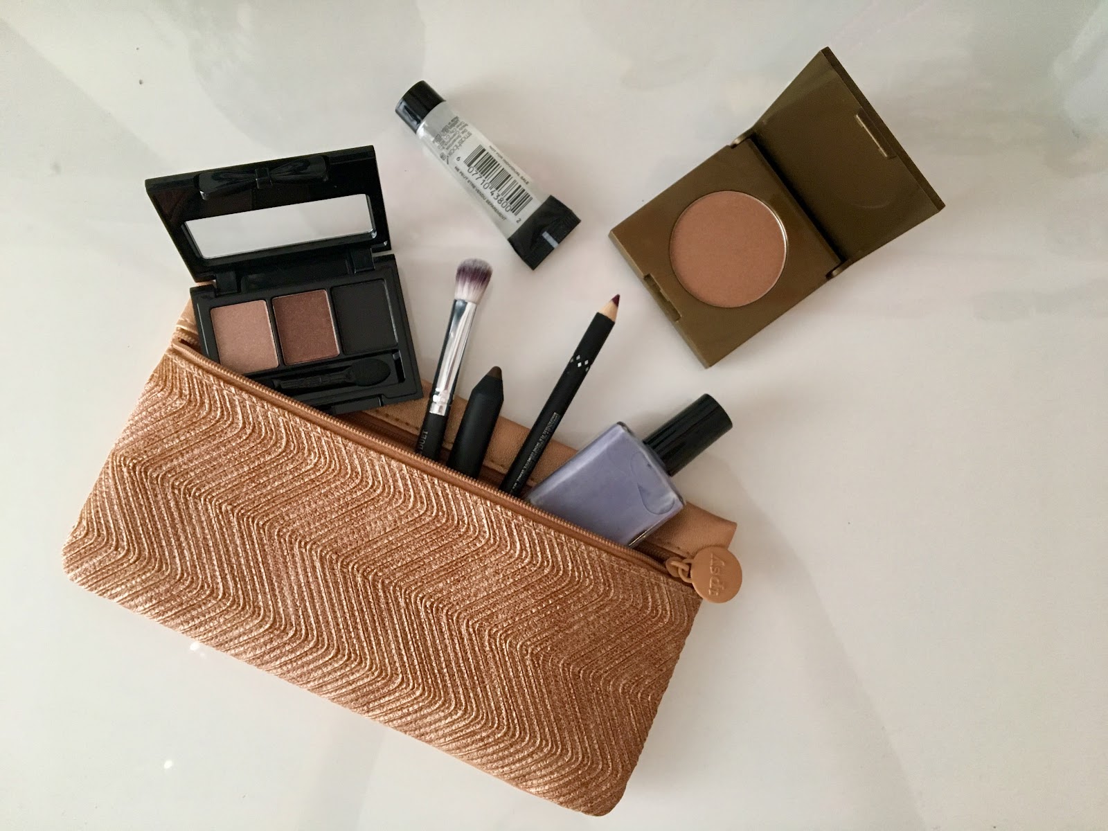
Lastly, I presented them with some makeshift photos that I had taken of a few beauty products. They liked the clean look of these images, and they showed strong support for the image that looks like the products are magically falling out of the makeup bag. I plan on using this look for the picture in my advertisement since I believe I will be making an ad for a monthly beauty subscription bag (name of the company is yet to be decided upon). Overall the group meeting was a great way of understanding what choices were heading in the right direction and which ones needed some modification.
Hopefully I can start taking pictures soon!


See you tomorrow!
Catalina

Sunday, March 10, 2019

Fall Inspo!

Hello fall-lovers! Today I’ll be talking about a few pictures I took of some fall beauty products that I had at my house.
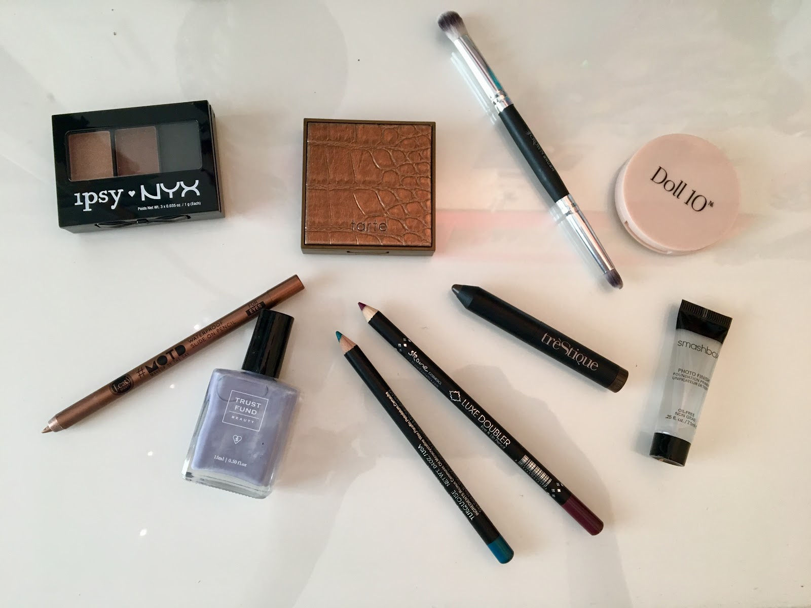
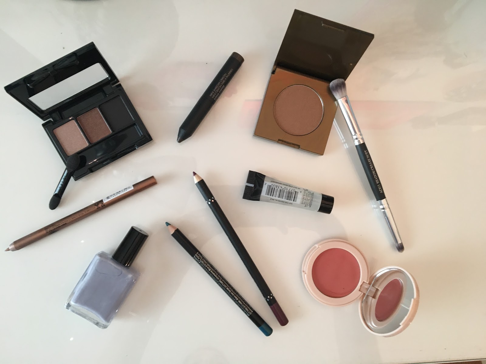
After looking at the images and products from a previous blog post, I decided to look around my house to find a few products. You’d be surprised at what you have laying around your house! Here are some pictures that I took:


First, let’s talk about brands and copyright. It is absolutely essential for me to master the art of taking pictures of products without showing the brand, whether it be by covering it or hiding it. This is done so that my magazine is free from copyrighted products. Here’s a picture of the products with the brand showing:


Now this is a picture of the products when I tried to hide their brand as best as I could:


Not bad, huh? Don’t worry, these are just preliminary pictures that I took of the products, nothing professional. I definitely need to master how to take pictures though! I know I need a better white background (that isn’t reflective hehe) and better lighting. I’d also like to borrow my mom’s camera and ring light to take the pictures so I can get the most high-quality shot I can. Once I do my official photoshoot, I’d also want to make ‘smears’ of blush or cream to create a more artsy look.
One other idea I wanted to share: I’d really like to make the page next to my table of contents an advertisement for a monthly beauty subscription service. I got the idea as I was rummaging through my drawers and came across a some Ipsy pouches and products (in fact, all of the products in the previous images came from an Ipsy bag!) I’d love to implement this kind of ad by making my own ‘beauty subscription service’ since they’re very popular right now.
I’ll be looking on Amazon in the next couple of days to see if I can find some inexpensive fall beauty products (especially some face masks, lotions, and lip balms). I’ll let you know what I find!
I also really liked how one particular shot turned out:


I love how it looks! I drew inspiration from this picture right here:


This shot is one I’ll be perfecting so that I can achieve the ultimate picture of fall products that just so happened to fall out of your bag perfectly. I hope you enjoyed looking at my progress so far! Next week, it’s showtime. Hopefully I can start taking some cool pictures for the magazine on the weekend. Only time will tell!


Au Revoir,
Catalina


Image Citations (in order of appearance):
Masseau, J. Fall Beauty Refresh: Products You Need, Now. Retrieved March 10, 2019, from https://www.besthealthmag.ca/best-looks/beauty/fall-beauty-refresh-products-you-need-now/

Saturday, March 9, 2019

My Guide to Two-Page Spread Layouts

        I'm back! Today I'll be researching some article layouts from various fashion magazines so that I can gain inspiration for my own two-page spread. When creating a layout, it's important to not only engage the reader and include cool graphics/images, but also to be easy to read and not overly cluttered. The text should follow an organized structure and the images should enhance the article, not obscure it. For my own layout, I'm looking for something that's pleasing to the eye and has many images since fashion is very visual. I now present you with my top 5 favorite layouts. Enjoy!
This first layout from Harper’s Bazaar Magazine is very appealing and is mainly about beauty. I love the ‘collage’ look that it has, as I planning on creating this type of design as well. The creators did a great job at overlapping different images of models and beauty products, as well as including ‘smears’ of blush or cream to achieve a ‘messy’ look. This two-page spread has the perfect amount of text in my opinion; readers are often more enticed by the images than the actual text itself. You now what they say… an image is worth a thousand words! Each picture contains a short description of the product shown, including the brand and price. This is important to note for my own two-page spread. This is a great two-page layout that I plan on taking inspiration from.


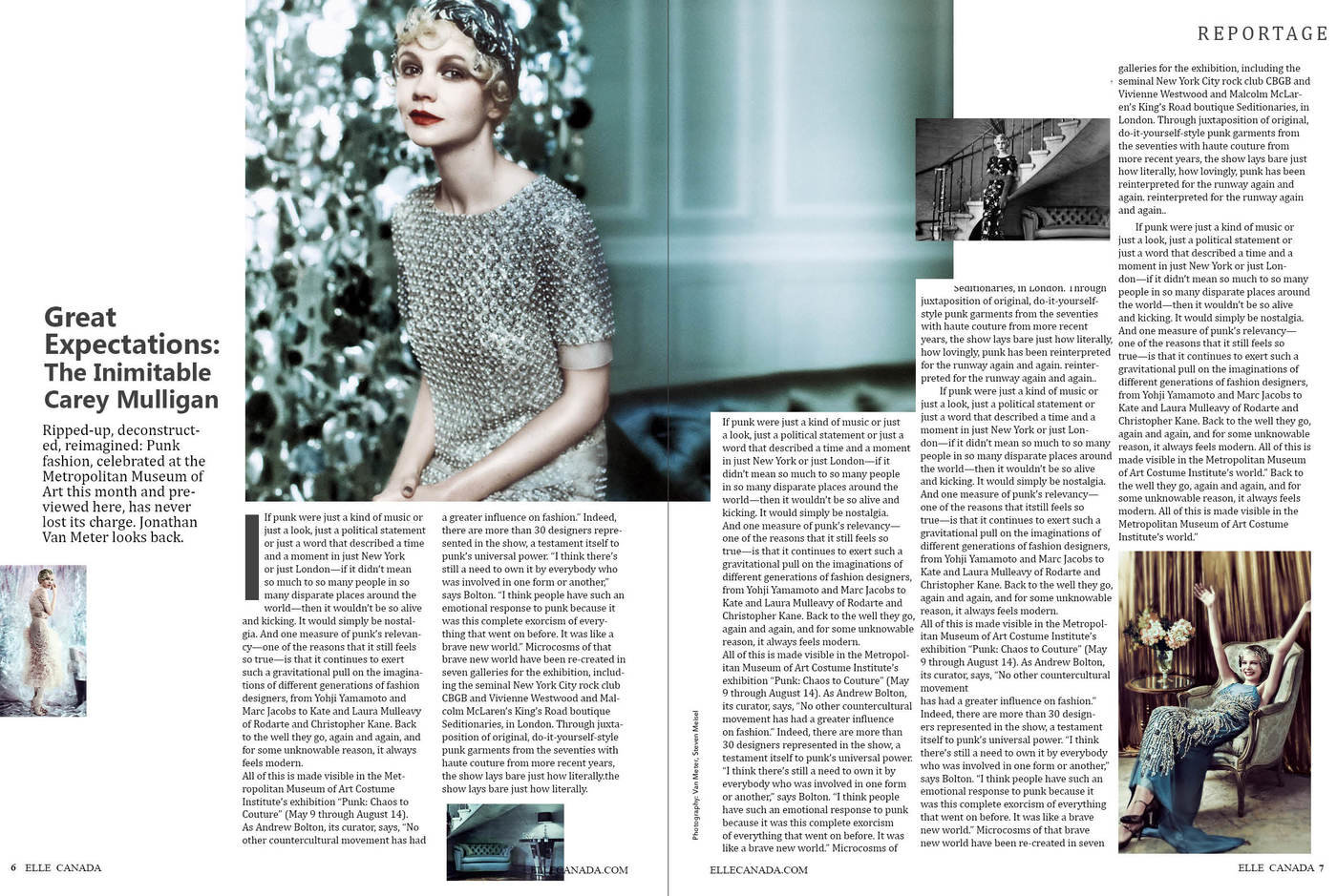
This two-page spread from Elle Magazine has a more classic and clean look. The title ad a short description are placed on the side of the article, which draws more attention to them. I find the blue theme very attractive, so I’ll definitely be incorporating a warm-toned look in my own two-page spread. I like that the magazine didn’t overload the spread with two many images, but I feel as if there is too much text. I think that they should shorten the article and include more graphics to make the layout more visually engaging. It is highly organized and simplistic, so I’ll be drawing a little inspiration from this magazine spread as well.


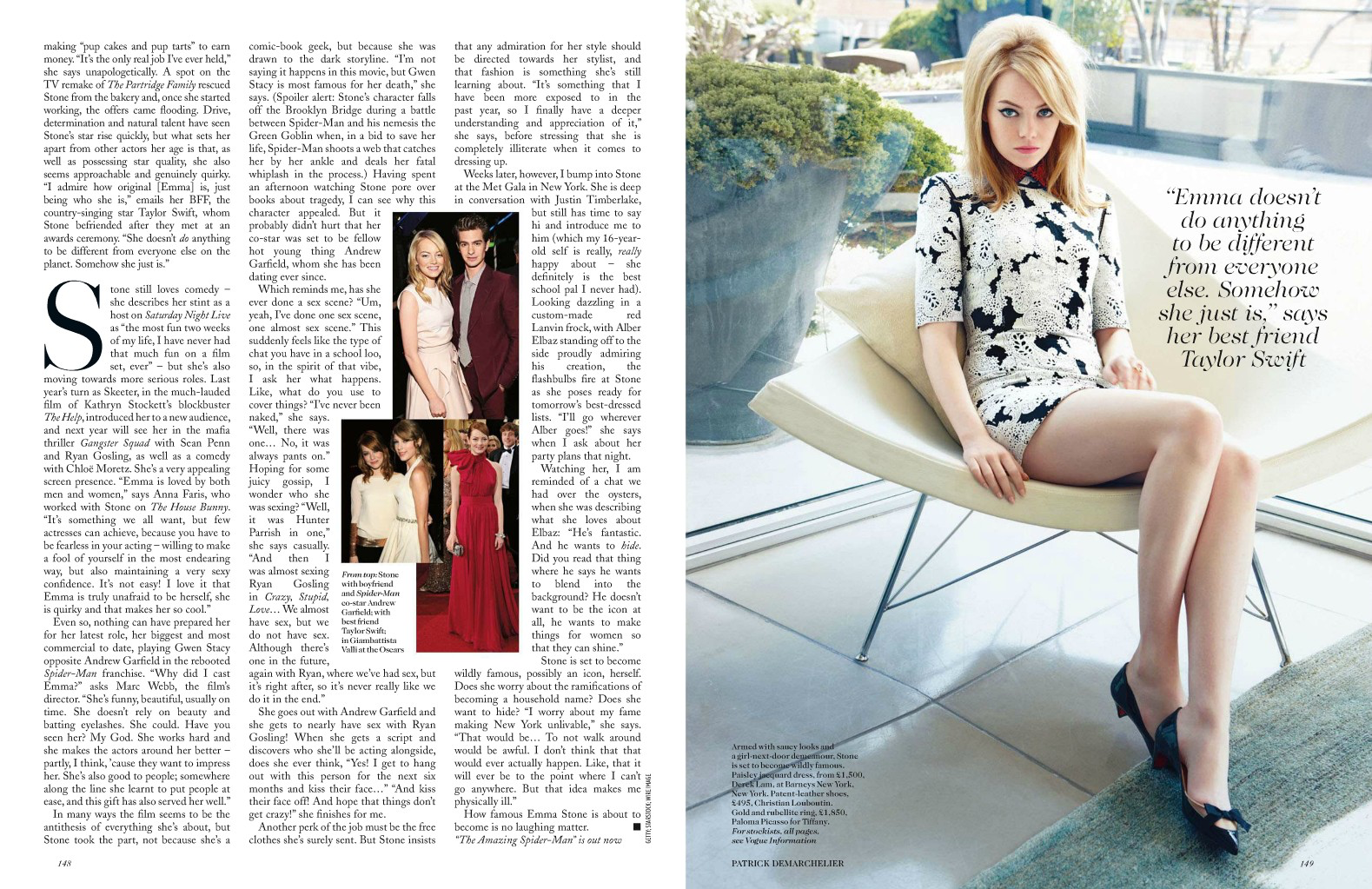
This two-page spread layout from Vogue Magazine has mainly all of the text on the left-hand page, and the central image on the right. I like how it included a short quote on top of the image; I think it makes it more engaging for the audience and draws attention to the quote. I like how they also included small pictures of the model within the article, so as not to have an overabundance of text. Although this layout looks very clean and elegant, I don’t think this is the look I’m going for. I’d like to have more, smaller images all throughout the pages, with text on both pages as well. However, I do like the capitalized letter to indicate the start of the article. I’ll probably be including this feature in my own spread.


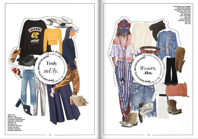
Lastly, this layout reminds me of a mood board in that it has different themes for each outfit. I plan on basing my own two-page spread in examples like these, which are collage-like and very pleasing to the eye. However, since this spread is probably a part of a larger article within the magazine, it does not include much text. One idea that occured to me was creating this design on one page and then having text and small images on the other page. In addition, since my magazine will include fashion and beauty, I will create a collage with both clothing and makeup products. I also really like the different kinds of fonts and sized arranged in a circular pattern on the pages. As long as it does not look confusing, I’d like to implement this in my own layout as well.

Thanks for reading! Goodnight!
Catalina


Image Citations (in order of appearance):
Vaughan, K. (2012, October 22). Double Page Spread Fashion Magazine. Retrieved March 9, 2019, from http://kirbyvaughan17.blogspot.com/2012/10/double-page-spread-fashion-magazine.html
Yao, Y. (2014, January 5). ELLE Fashion Magazine Design (Layout). Retrieved March 9, 2019, from https://www.coroflot.com/yingyao/ELLE-Fashion-Magazine-DesignLayout
Alegator Dedreapta. Vogue Magazine Spread. Retrieved March 9, 2019, from http://alegatordedreapta.info/marvdwn-vogue-magazine-spread.awp
Design School. (2016, February 8). How to Design a Fashion Magazine Like Vogue. Retrieved March 9, 2019, from https://blog.flipsnack.com/how-to-design-a-fashion-magazine-like-vogue/